The Economy in One Picture
I found this graph to say more about the US economy and the welfare of the average citizen than anything I've seen in a long time.
What's the basis for the figures? AfferentInput crunched the latest numbers income distribution from the CBO per this post which has a very straightforward explanation of what he did.
[H/T to Jamess at dkos for the original graph and his reference to Mike Caulfield at Blue Hampshire for his post which is also worth reading.]
Take another look at the Y-axis. That's -30 on the bottom.
He has a newer post up in which he comments:
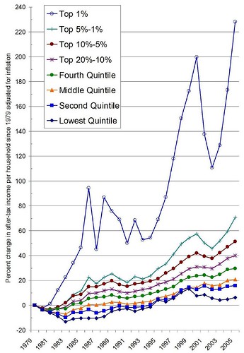
My previous posts focused on change in share of income over time. Those posts showed that the highest 5% of income earners have greatly increased their share of total income, whereas the bottom 90% has actually decreased in share of income. That's a bit meta, given that it doesn't take into account overall increases in total income. I decided to create some new figures that just focus on income.
Some notes about what I did, first. I used the data that the CBO released last week. I used after-tax income; this is important because it is a more conservative assessment of income. If I used pre-tax income, the differences I show below would be even more exaggerated. In addition, given that some groups don't pay any federal income taxes, I felt it was probably better to use after-tax income so that we're comparing apples to apples. The data came from page 1C in their spreadsheet.
He goes onto give more detail about his analysis and then provides this chart which is equally interesting, IMO.
The fig below shows percent change in income since 1979 adjusted for inflation. As you can see, every group is making more money now than they did in 1979. Yet some groups are doing a little bit better than others.
Do check out his posts.
The widening divide
If America had $100 and 100 people...
More on Income Inequality
Change in income over time
posted by dwahzon @ 11:06 AM
![]()


0 Comments:
Post a Comment
<< Home